How do you measure your site’s effectiveness at supporting your business goals? The easiest method is to track your conversion rates.
On the surface, conversion rates show the percentage of visits that end in a desired action, such as a purchase, signup, or demo request. As such, they’re a valuable KPI.
But there’s much more you can find out about your site and marketing strategies by tracking this metric. And the best way to gather insights? Focus on what isn’t working.
By identifying your site’s biggest conversion killers and resolving them, you can reduce unnecessary friction and create clearer paths to conversion. This guide shows you where to start.
Highlights
- Nothing kills purchase intent like unclear messaging. To keep leads motivated to buy, make sure they understand your offer’s value.
- Being outspoken about who your products are (or aren’t) for removes doubt. Do it to qualify leads and move them closer to a buying decision.
- Help your prospects understand how your offer relates to them. Context and personalization can be extremely valuable in encouraging conversions.
- CTA button optimization remains one of the leading strategies for boosting conversions. Make sure your leads know exactly what they’ll gain by converting into clients.
Unclear product functionality increases buying friction
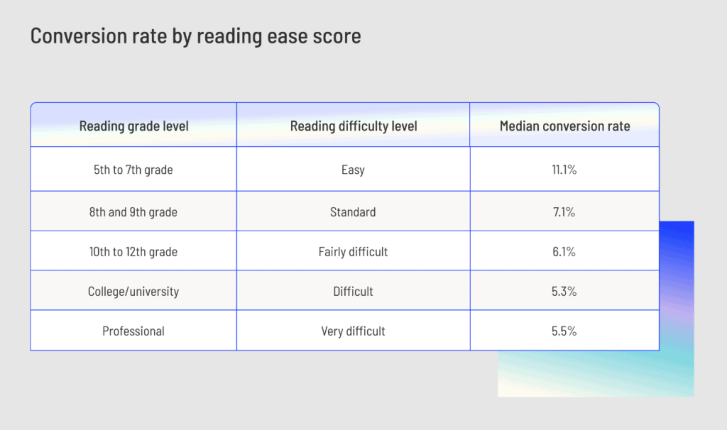
Consumers’ understanding of your product directly affects conversion rates. Great website design doesn’t hope visitors will understand product functionality. Instead, it ensures they do.
Source: unbounce.com
Check out the research cited above. It clearly shows that a lower reading difficulty level coincides with higher conversion rates. But what does it mean in the real world? In simple terms, the data indicates that unclear product functionality increases buying friction.
Of course, clarity isn’t just about the readability score of your on-site content. Many design and copy factors affect your web visitors’ ability to understand the value you offer.
To prevent these from affecting your conversion rates, focus on reducing uncertainty. Make it easy for your web visitors to understand what your solutions do. Prioritize speed of understanding over depth (you can always add more explanation later). Aim to minimize buying friction caused by limited product knowledge.
Ideally, accomplish these goals with a mix of copy and visual content. Showing how a product works can reduce uncertainty without forcing prospects to rely on copy alone.
Also, describe your solutions in terms your ideal customers will understand. Yes, when targeting expert buyers, you may get away with using niche terminology. But if your target audience is regular end users, simplifying your language can go a long way toward boosting comprehension.
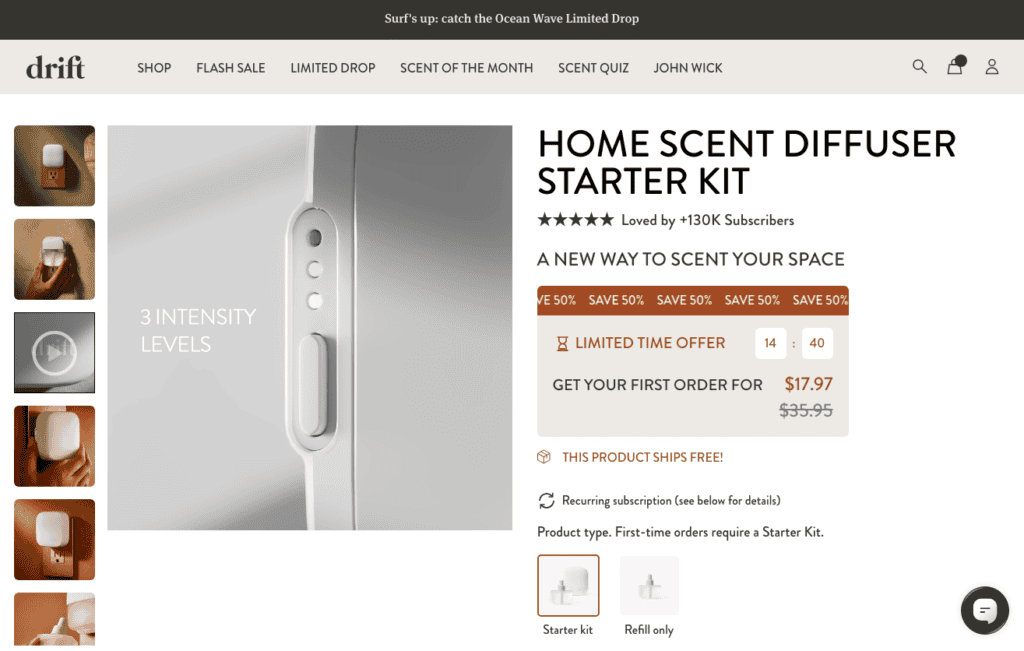
Drift is a great example of a brand that intelligently addresses uncertainty-related conversion barriers on its product pages, as shown on its home scent diffuser page. Take a close look at the product descriptions and gallery.
You’ll find that Drift doesn’t use complex copy to explain what the solution does and how the setup process works. Instead, Drift does it through video content. And the approach works. By making this choice, the brand doesn’t have to introduce potential buyers to the product’s parts. Instead, it can just show how the scent diffuser works.
And the outcome? A product page that successfully explains product functionality. Plus, less buying friction from web visitors’ lack of product understanding.
Source: drift.co
Disorganized product categories make it hard to find the right product
Why do web visitors choose to stop interacting with a website? Research suggests that technical performance and visual appeal both affect engagement rates. Nevertheless, some of the most common causes of website abandonment include user experience design issues.
Essentially, when shopping (or simply browsing) online, consumers want convenience. So, what happens if your website makes it hard for them to find the right solution for their needs? The most likely scenario is that they’ll stop interacting with your site.
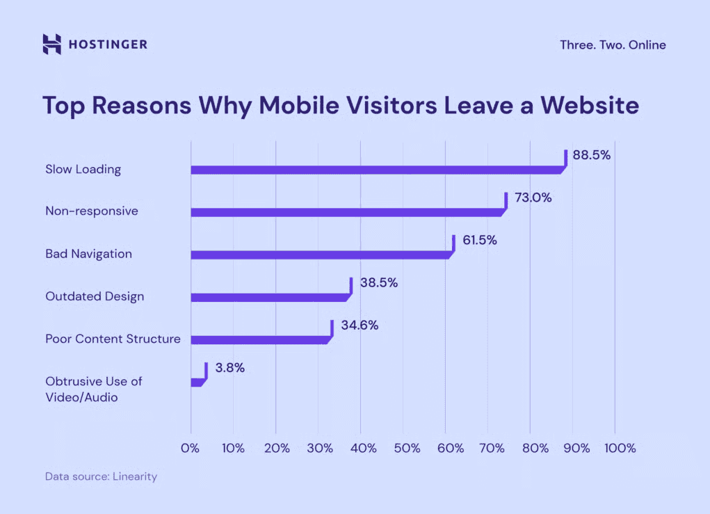
Hostinger research found that 61.5% of web designers identify bad navigation as a major reason visitors leave websites.
Source: hostinger.com
The good news is that you can prevent this hidden conversion killer from harming purchase intent. All it takes is paying attention to how you organize product categories.
The goal is to make it easy for visitors to identify the right product for their needs. So, try to structure product categories around how your ideal customers make purchasing decisions.
For example, you can do this by prioritizing use-case compatibility. You can also categorize solutions by product type. Or, if you sell a large inventory of solutions, you can categorize them by brand, price, or model.
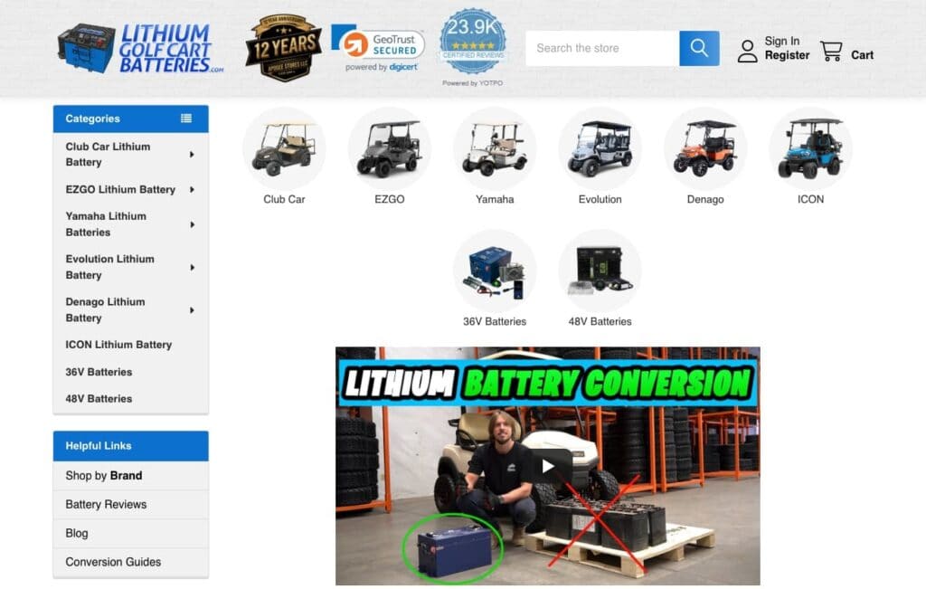
Lithium Golf Cart Batteries is an excellent example of a brand that includes several of these categorization factors in its navigation menus.
Why this particular approach? LGCB understands that its audience needs an easy way to find products compatible with their golf carts. And this doesn’t just include the golf cart’s make. Battery type and power are equally important for performance and compatibility.
Source: lithiumgolfcartbatteries.com
To meet this consumer need and minimize the conversion-harming effect of a disorganized navigation menu, LGCB allows shoppers to filter its inventory by several criteria. This helps prospects find what they need quickly. More importantly, it creates an enjoyable, productive web browsing experience. Plus, reducing product discovery time shortens the sales cycle.
Unanswered qualification questions cause qualified prospects to drop off
We’ve already mentioned uncertainty as one of the biggest conversion killers on modern websites.
Uncertainty doesn’t just arise when consumers fail to see a solution’s value. It can also hurt purchase intent when prospects are unsure whether the offer is right for them.
Yet, that alignment between what you offer and what your ideal customers need is crucial for achieving high conversion rates.
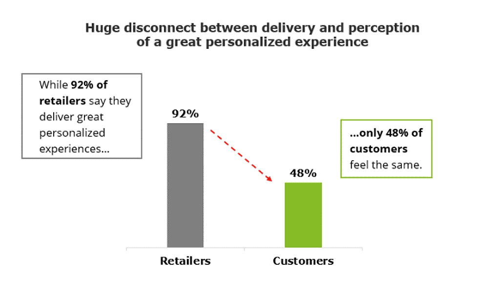
After all, consumers don’t just expect brands to understand and care about their unique needs and pain points. They require hyper-relevant, personalized solutions that work. Unfortunately, Deloitte research found that only 48% of customers feel brands deliver great personalization experiences.
Source: deloitte.com
But what does the lack of content tailoring have to do with purchase intent? Well, in some ways, it prevents web visitors from self-qualifying during their buyer’s journeys. If web visitors can’t determine whether a product or service is right for them, they’re highly unlikely to make a positive buying decision.
To fix this sales obstacle, focus on helping your audience recognize the personal or tailored value your offer delivers.
Several methods can help. You can choose to explain your processes. You can insert qualification criteria into key conversion-oriented resources, such as your pricing pages. Or use educational content, like FAQs, to answer your audience’s specific questions and set their expectations early in the buyer’s journey.
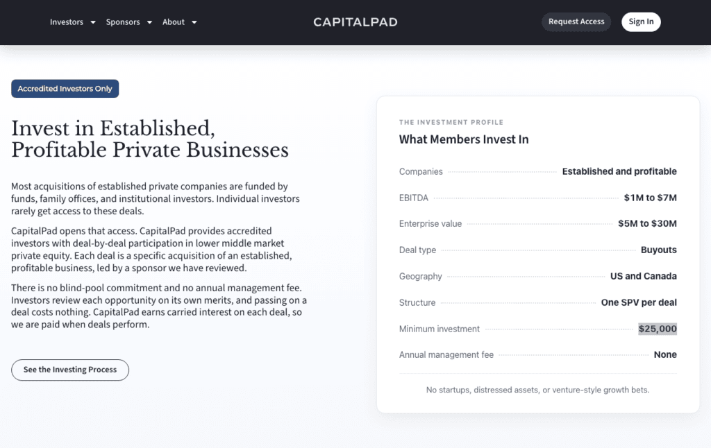
CapitalPad applies this strategy by making its qualification criteria visible before prospects apply. This private equity investor group lets individuals invest in lower-middle-market acquisitions. What’s specific about CapitalPad is that it operates in a very complex niche. And that means some of its leads might not be entirely certain if they’re a good fit.
To prevent this uncertainty from causing qualified prospects to drop off, CapitalPad uses a quick self-qualification resource. This proactively answers most of its prospects’ questions. More importantly, it creates clarity before asking web visitors to begin the application process.
Source: capitalpad.com
No clear differentiation makes comparing options difficult
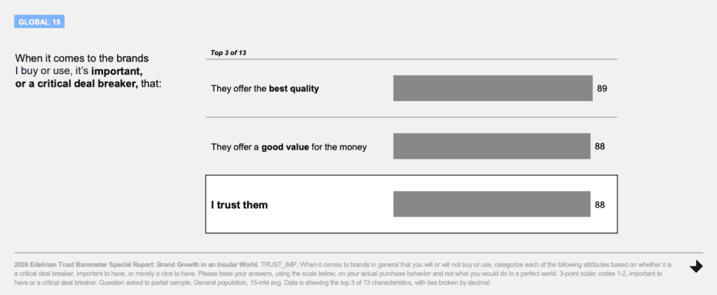
What are consumers’ top priorities when making buying decisions? Edelman’s 2026 research shows that trust is now a purchase consideration on par with product quality and value.
Source: edelman.com
If your website is losing conversions, the problem may not be product quality or brand reputation. It may simply be a lack of clear differentiation from competing offers.
To boost purchase intent, highlight how your offering differs from alternatives. Educate your leads about your solution’s benefits through engaging differentiation content. And use comparison tables, side-by-side feature breakdowns, and clear value distinctions.
Ultimately, prospects are highly likely to do pre-purchase research and comparisons. And ensuring they do that on your website offers several benefits.
For one, you can use your differentiation content to highlight the unique value you offer. Additionally, investing in differentiation resources can help you describe the specific advantages of your solutions compared to popular alternatives in your niche.
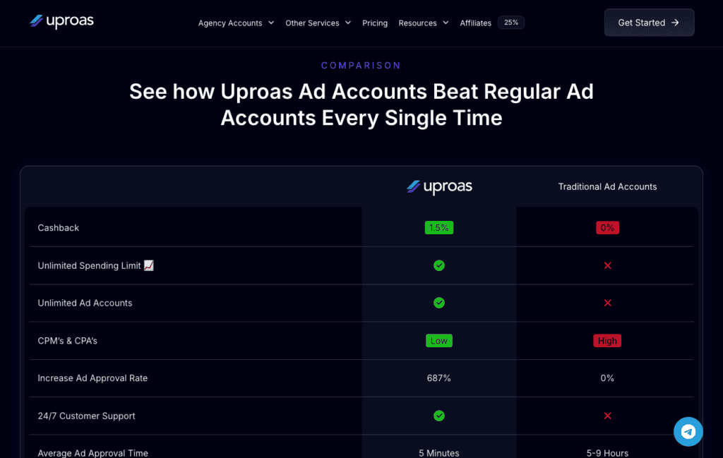
For example, check out Uproas. This brand understands that a lack of value differentiation kills conversions. So it emphasizes the benefits of its solution over alternatives.
The side-by-side comparison table highlights several differences, including cashback, unlimited spending limits, low CPMs, better ad approval rates, 24/7 customer support, and an average ad approval time of 5 minutes.
Framed this way, the comparison makes the differences between Uproas and traditional ad accounts easier to evaluate, reducing the effort required to compare the two options.
Source: uproas.io
Lack of real-world context makes products feel less relevant
Personal relevance can play an important role in how consumers evaluate brands. Edelman’s 2025 Brand Trust research identifies a broader shift toward personal relevance in consumers’ relationships with brands. That makes it increasingly important to show prospects how a product fits their specific needs and everyday lives.
But how does this data relate to common conversion killers? Well, if your site isn’t converting as many customers as you’d like, the culprit may be a lack of emotional or contextual clarity.
Ultimately, people won’t invest their hard-earned money in a product they don’t perceive as valuable. And they’re even less likely to buy if they can’t picture how a product fits into their everyday lives.
To guide leads toward conversion, describe real-life scenarios where your solutions deliver value. Focus on practical use cases and relatable scenarios. Or, you can reverse-engineer purchase intent by highlighting a frustrating consumer pain point and positioning your product as the solution.
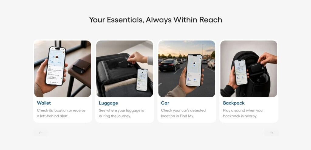
This Spotminders Tracking Card page is an excellent example of how brands can implement this conversion-boosting strategy. On the page, the company demonstrates multiple everyday use cases for its product.
These include wallet, luggage, and car tracking. In doing so, Spotminders demonstrates the usefulness and versatility of its solution. By showing several concrete scenarios, the page helps visitors assess whether the product fits their own needs.
Source: spotminders.com
Weak calls to action leave visitors without a clear next step
Sometimes, the biggest conversion killer on your website isn’t that you’re not communicating unique value. It’s just that your conversion elements, including your calls to action, aren’t compelling enough to drive purchases.
So how can you ensure your CTAs incentivize conversion? Start by optimizing copy and timing.
It’s not enough to clearly describe the positive outcomes web visitors can unlock by converting. It’s equally essential to match CTA copy with buyer intent. Timing also matters: encouraging web visitors to convert at the right moment can help overcome common conversion obstacles.
The ideal scenario is that your on-page content convinces your prospects of the value of your offer. Then, the CTA button presents the next (risk-free) step in their journey toward resolving their pain points.
Source: clickup.com
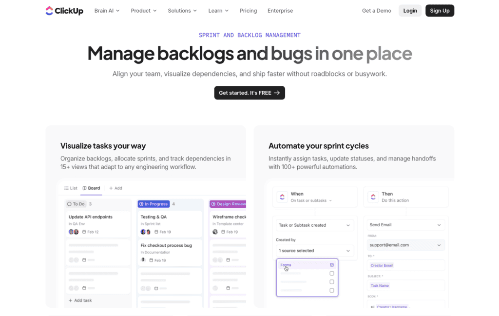
If you check out ClickUp, you’ll find the brand fully optimizes its CTAs to boost conversion rates. For starters, it invites prospects to “get started” for free, a copywriting choice that reduces perceived risk and removes a common conversion obstacle.
More importantly, ClickUp includes a CTA after every single product benefit section. This reinforces conversion as the way to get the value the brand offers.
Plus, it aligns with the natural progression through the sales funnel by letting web visitors sign up where they are (without forcing them to hunt for the next action they need to take).
Final thoughts
Conversion optimization is an ongoing process. And, as consumer behavior trends evolve, so will the best practices for boosting sales.
To ensure your website acquires new customers, track conversions and on-site behavior. More importantly, follow the conversion optimization best practices outlined in this guide.
By removing the six conversion friction points covered here, you’re bound to be headed in the right direction. From there, you can continue monitoring performance and making incremental conversion optimization changes to boost sales.
ddressing the six conversion friction points covered here gives you a practical starting point. From there, use conversion and on-site behavior data to prioritize incremental changes that remove the most friction.
If weak organic visibility is limiting the number of qualified visitors reaching these conversion paths, uSERP can help strengthen the SEO and authority behind them. Book an intro call to discuss your growth goals.