




Every brand starts with an idea, but it’s the execution that decides if people remember it. Design and identity are the two forces behind that memory.
One shapes how your brand looks, the other defines how it communicates. Connecting them allows each touchpoint to tell the same story.
This guide shows you how to bring brand design and identity together so that everything your audience sees and feels points in one direction.
Highlights
- Design and identity work as one system. Brand identity defines who you are and what you stand for, while brand design makes those ideas visible and tangible through color, typography, and layout.
- Consistency builds trust. A unified visual and verbal presence creates recognition across every channel and reinforces credibility over time.
- Guidelines keep your brand aligned. A clear brand guidelines document your mission, tone, and visual standards so that every team member creates from the same foundation.
- Collaboration drives stronger results. Brand marketing and design should inform each other, ensuring that every campaign reflects both your strategy and your style.
- Emotion creates connection. The goal is to make people feel something that reflects your brand’s purpose and values.
What’s the difference between brand design and brand identity?
Think of brand identity as the internal definition of who a brand is and what it stands for. It’s the strategic core that shapes how a company wants to be seen, felt, and remembered.
Brand design, on the other hand, translates that strategy into something people can see, recognize, and connect with.
Brand identity encompasses the values, mission, personality, and tone that guide every creative and communication decision. It answers questions like:
- What does the brand believe in?
- How should the brand sound when it speaks?
- What emotions should it evoke?
It’s the blueprint, the consistent idea that guides every interaction, whether someone is reading a blog post, scrolling past a social ad, or walking into a retail space.
Brand design is where those ideas become tangible through graphic design and visual elements. It’s the creative craft of turning abstract concepts into a sensory experience.
Colors, typography, logos, photography, and layout systems make a brand recognizable at a glance. Once those rules are set, an AI image generator can help you produce new visuals that still look like they belong to the brand.
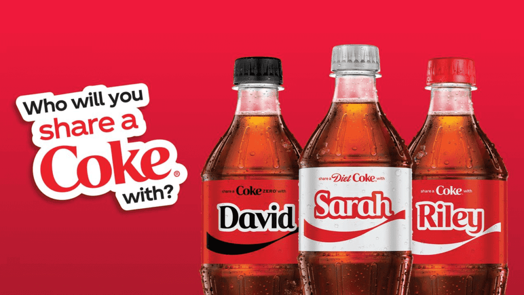
Take Coca-Cola, for example. Its identity is all about joy and connection. For over a century, everything the brand does ties back to that emotional foundation, bringing people together over a shared experience.
Its design reinforces that identity at every touchpoint:
- The bold red that sparks energy
- The curved logo that feels warm and familiar
- The classic bottle shape that’s become iconic in its own right
But where you really see the brand identity and design working in perfect sync is the “Share a Coke” campaign. The identity (connection through shared moments) drove the idea.
The design (customized bottles featuring people’s names) made the idea personal, visual, and interactive.
The disconnect between brand design and identity
The hard truth about brand consistency is this: most teams say they want it, but few are truly built for it.
In Frontify’s 2025 State of Marketing Efficiency Survey of 400 marketing leaders, 39% ranked creating a strong, unified brand experience across all omnichannel touchpoints as their top priority.
Yet those same leaders admitted to major inefficiencies in how they manage their brand assets, portals, templates, and design systems. This is the unglamorous infrastructure that actually keeps identity consistent.
A logo refresh or new color palette doesn’t mean much if your email templates, social media graphics, or internal slides all tell slightly different stories. Every inconsistency chips away at trust. And customers notice.
Because simplicity pays. Research from Siegel + Gale shows 64% of consumers are willing to pay more for simpler brand experiences. And 78% are more likely to recommend those brands to others.
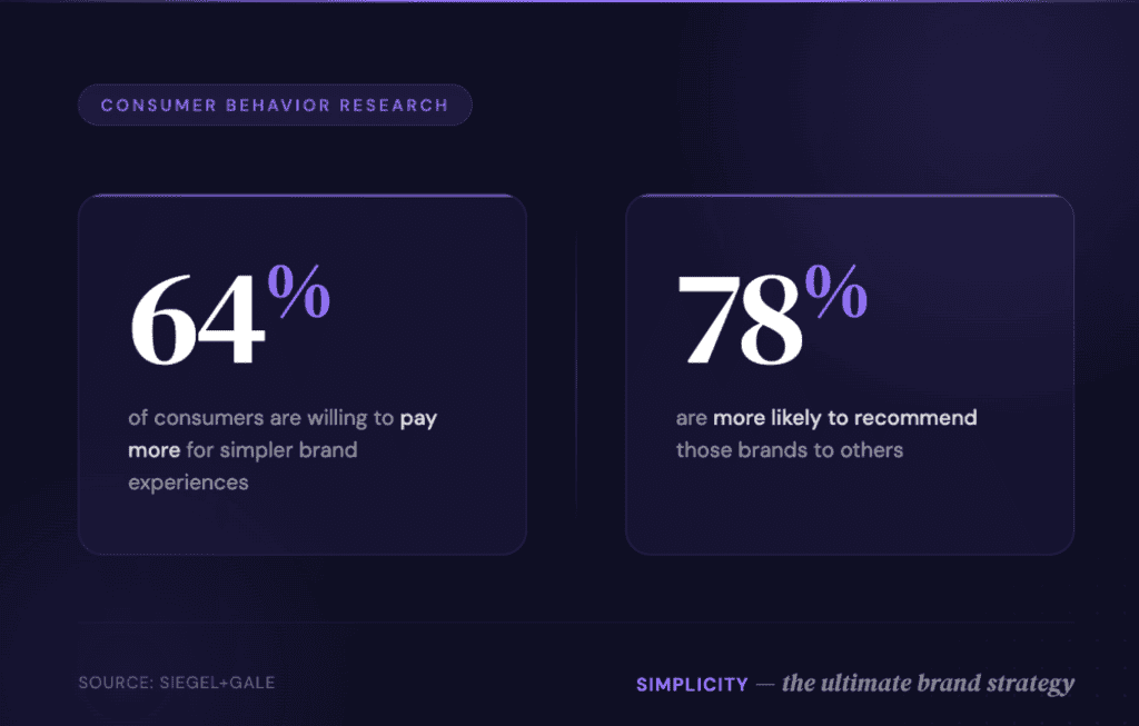
Image created by the author
What creates these effortless experiences? A unified brand design and identity.
How brand design and identity can work together
Brand identity is far more than just a logo or a tagline. It’s the foundation of how a brand presents itself and how it wants its audience to perceive it.
What does that look like? Consider a SaaS marketing strategy. The brand might pair sharp, conversion-focused visuals with clear, confident language. This is important for showing credibility without overcomplicating the message.
The identity defines the personality, values, and promise of the brand. Then, graphic design and visual elements take that identity and bring it to the real world. Together, they form a powerful combination.
When you roll out a brand, the graphic design team shapes the look and feel of the logo, typography, color palette, imagery, and iconography. That’s the visual side. For example:
- The logo becomes a memorable visual element.
- Color palettes evoke emotion and set tone.
- Typography, imagery style, and iconography form a visual language that aligns with identity.
Your brand is how you speak to your audience. This involves the tone, word choice, and style of language.
For example, you might use creative language, which could include metaphors, phrasing, and even sentence structure that express the brand’s personality. The voice and language tell the story, reinforce positioning, and complement the visual representation of your brand.
Maybe your brand is bold and disruptive, so your voice is confident, candid, even cheeky. Or, maybe your brand is transitional and premium. The voice might be polished, refined, and selective.
Consider a holistic wellness clinic, like Parsley Health. The brand’s entire presence is built around a single promise: making functional medicine feel personal.
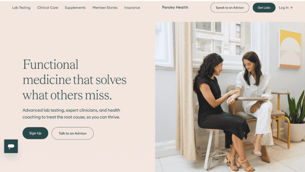
You can see it in the way the brand communicates. Instead of promising quick fixes, the language focuses on empowerment:
- “Get to the root cause.”
- “Feel better, faster.”
- “Whole-body health, made modern.”
It’s confident, but never cold.
The design tells the same story:
- Calm, neutral tones
- Clean sans-serif typography
- Photography that highlights real people
This shows that when you combine creative language with memorable visuals, your campaigns can stand out and connect emotionally with audiences.
How to integrate brand design and brand identity
A lot of brands treat design and identity like two separate projects. They tackle brand strategy first and visuals later.
The truth is, they’re two sides of the same coin.
Your identity defines what you stand for. Your design shows it in action. Developing both together ensures your brand feels seamless across different marketing channels, from your website and packaging to the way you speak on social media.
This consistency should also extend to physical brand materials, such as packaging and custom bags, which can help reinforce your visual identity and create a more cohesive brand experience. When these items reflect your brand’s colors, logo, and overall design, they become an extension of your identity that customers can recognize and remember.
Audit your current identity
Before you redesign anything, you need a clear picture of where your brand stands today. Start by auditing your existing identity. Look at your messaging, visual consistency, and customer perception.
Ask yourself:
- Does our visual design reflect who we say we are?
- Is our tone of voice consistent across web, email, and social?
- Are there mismatches between our stated values and how we show up online?
If your visuals feel dated or disconnected from your messaging, it’s a sign your design and identity have drifted apart.
Or maybe you notice your company’s online presence could be a lot stronger. Getting brand mentions can help you gain more visibility.
Whatever the cause, an audit helps you identify where any misalignment happens and where your brand story falls flat.
Build (or update) your brand guidelines
Once you’ve identified the gaps, create a set of unified brand guidelines that bring your strategy and visuals into alignment.
Your guidelines should include more than logo placement and color codes. They also need to document the essence of your brand, which includes your purpose, voice, visual system, and emotional tone.
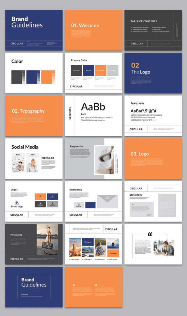
That way, every designer, writer, and partner can stay on the same page.
A strong set of guidelines includes:
- Core identity elements: Mission, values, personality, and messaging pillars
- Voice and tone rules: How your brand speaks in different contexts (e.g., website vs. customer support)
- Design system: Logo usage, color palette, typography, imagery, iconography, and spacing standards
- Application examples: Mockups showing how design and copy work together in real campaigns, ads, and digital content
Treat your guidelines like a living document. As your brand evolves, update them to reflect how your design and identity continue to grow together.
Align design decisions with brand marketing
Too often, design and marketing run in parallel lines. Marketing wants leads. Design wants beauty.
But brands that are most likely to grow the fastest run these functions side by side toward the same goal.
Your brand marketing strategy should inform your design direction, not compete with it. For example, if your identity is about innovation, your campaigns should look modern and confident.
If it’s about approachability, your visual design should feel open and human.
That means designers and marketers need to collaborate early, before campaigns go live. Share audience insights, performance data, and creative direction in the same room.
When both teams understand the “why” behind a campaign, the “how” becomes much easier to execute.
Use modern design platforms to unify your visual system
If your brand assets live in 15 different folders and three random Slack threads, you are likely dealing with operational chaos.
Create a shared folder or workspace (e.g., Google Drive, Notion, or Figma) that stores your logos, brand colors, and creative templates, which you created on a platform like Design.com.
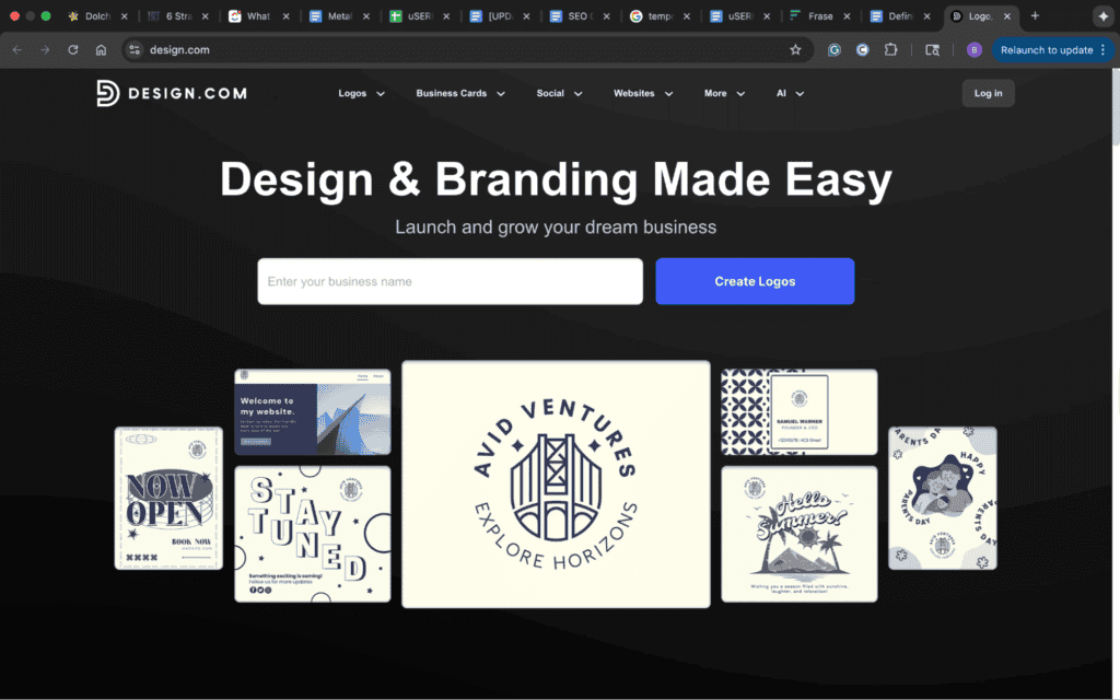
This ensures everyone, from designers to marketing interns, works from the same visual foundation.
Think of it as operationalizing your brand identity. With your design system centralized, your identity stops living in a slide deck and starts living in your day-to-day marketing.
This means more consistent campaigns, faster creative workflows, and zero off-brand visuals slipping through the cracks.
Partner with a digital agency (the right way)
If you’re rebranding or scaling quickly, partnering with a digital agency can help translate your identity into a cohesive design system. But not every agency approaches this work the same way.
The best partners don’t just make your brand look good. They make it make sense.
A skilled agency will:
- Start with a discovery phase that digs into your brand purpose, audience insights, and competitive positioning.
- Build design concepts that align directly with your identity, translating your mission and personality into colors, typography, and visual systems.
- Deliver assets that are flexible enough to scale across web, print, and digital campaigns.
- Provide documentation and training so your internal team can maintain consistency long after launch.
And don’t just rely on a design agency. Content agencies can also help you grow your brand by helping you create authoritative content, like blog posts, that builds trust.
Design for emotion
People don’t remember perfect layouts. They remember how a brand made them feel.
Your brand identity defines that feeling. Your design expresses it.
Whether it’s the calm of a wellness brand, the confidence of a fintech company, or the optimism of a consumer startup, your visuals should evoke emotion instantly.
This means using color, typography, and imagery intentionally because they align with what your audience needs to feel before they take action.
A perfect example is Oatly. The brand sells oat milk, but it does so much more. It sells confidence with a wink.
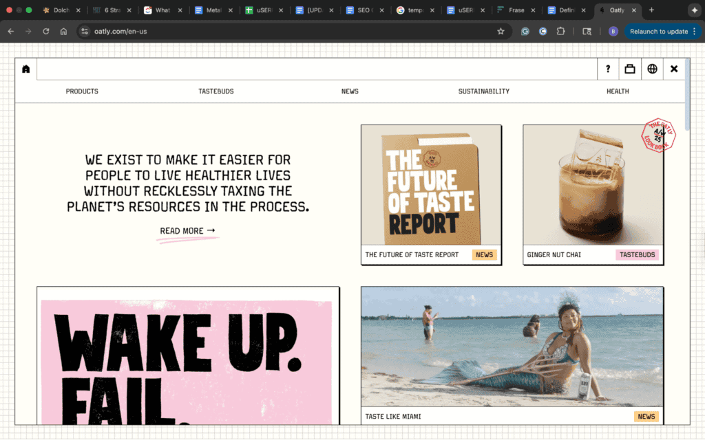
Most plant-based brands lean into clean whites and greens to signal purity and health. Oatly goes the opposite direction.
Each visual choice, from its hand-drawn typography to its loud, offbeat packaging, feels unapologetically human. The tone is cheeky and self-aware, the layouts intentionally imperfect.
Even the muted beige and blue palette stands out in a subtle, understated way: minimalist on the surface, but bold in attitude.
The calm, minimal design feels rebellious because of how it contrasts with the brand’s bold, irreverent tone.
Emotionally, that design decision makes Oatly feel:
- Trustworthy (because the muted tones feel natural and authentic)
- Confident (because it breaks category norms)
- Relatable (because it doesn’t take itself too seriously)
The power of unifying your brand’s look and voice
A strong brand design may seem effortless. However, it’s anything but. It comes from putting thought into the details.
Together, these details form a language your audience can recognize anywhere.
Design gives your brand a face. Identity gives it a voice. But content…that’s what makes people listen.
Ready to turn your content into the most powerful expression of your brand? Book a call with uSERP today.